


Posted on
Picking a Hue: Interior Color Schemes You’ll Never Get Tired Of
Get familiar with the color wheel, hues, saturation, temperature, and lightness to create interior color schemes you'll adore.
Choosing the color scheme of your home can be one of the hardest parts of interior painting. The hues of a room can change the atmosphere entirely for better or, if you’re not careful, for worse! Thankfully, there are a few resources and a team of trained professionals available to help guide you through choosing your interior color schemes.
Here are a few takeaways that we’ll go into more detail throughout the article:
- Use the Color Wheel: Utilize the color wheel to help determine which paint colors will complement each other.
- Trust the Experts: Take into consideration what is trending at the moment. Look at Colors of the Year for inspiration in your own home.
- Use Available Tools: You’re not in this on your own! Use the tools and services at your disposal.
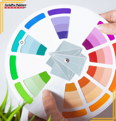
Color Wheel Inspired Color Schemes
The color wheel is a great tool to use to determine the properties of colors and which ones complement each other. It also allows you to determine the temperature of the color, which in turn helps create interior color schemes. For example, warm colors typically draw in a space, making them feel intimate, while cool colors expand a space, making it feel more open.
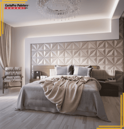
Monochromatic Color Scheme:
Monochromatic, meaning “one color” refers to a color palette using varying hues of a single color. Variations of lightness and saturation can create a crisp, clean design. The best part is you can do this with almost any color you desire.
One way to put this in effect is by varying neutral tones in a living room for a classic color scheme. Think of a beige like Sherwin Williams’ Unfussy Beige, accented by lighter colors like Mega Greige and Elder White.
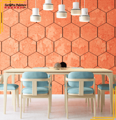
Complementary Color Scheme:
This means choosing two colors opposite each other on the color wheel. Depending on the saturation, these two colors can either be vibrant or more subdued. Either way, it will include both a warm and a cool color since they are on opposite sides of the color wheel.
One example of a complementary interior color scheme is an orange and blue kitchen. The kitchen is an inviting, happy place, so it’s fitting to use an exciting color scheme. And the contrast between the blue and orange adds an element of interest. Not to mention, the color orange is associated with stimulating appetites!
Painter’s Tip: If you like bright, eccentric colors, you can keep them grounded with neutral shades or natural wood tones. White, light gray, and even black paint colors will support the bold shades in your interior color schemes to give your room an integrated feel.
Popular Color Schemes We Love
If coming up with a color scheme on your own is something you’re not interested in, don’t fret! There are so many resources available to gather inspiration for your interior color schemes. One of our favorite places to look at is Color of the Year from popular paint companies.
Trending Colors for 2023
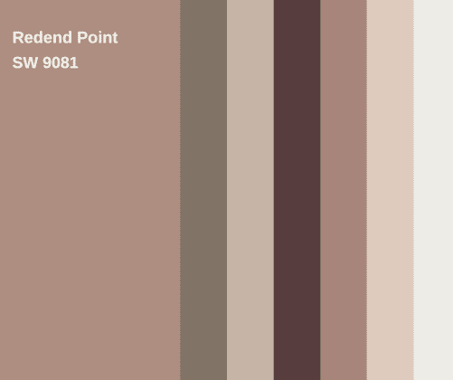
Sherwin-Williams: Redend Point
Sherwin-Williams Color of the Year for 2023 is Redend Point. The versatile color brings home the warmth and intrigue of the calming outdoors through its minimal, calming, and intriguing hues. We love using it to create interior color schemes for homes across the country.
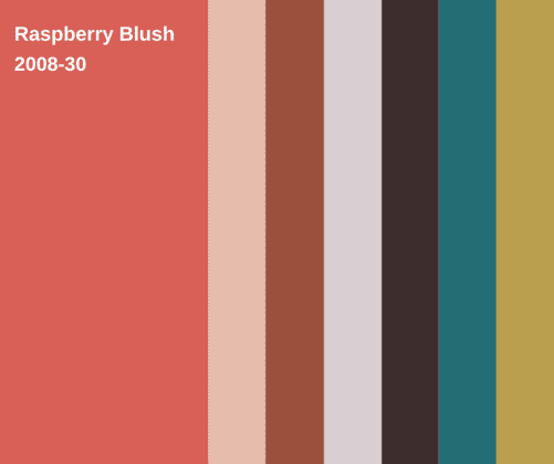
Benjamin Moore: Raspberry Blush
Benjamin Moore’s Color of the Year 2023, Raspberry Blush, takes on a bold color from the same vein. Their brighter red truly makes any home interior pop with life. While color schemes for this hue may not be as versatile, it may help you achieve the lively look you’re searching for.
Tools to Help You Pick Your Interior Color Schemes
In addition to these specks of inspiration, there are tools out there that can make your visualization process easier. For example, My PaintColors, CertaPro Painters® virtual house painter, can help you visualize your interior color schemes. And if you’re still having difficulty deciding, the experts at CertaPro Painters® will help you find the perfect color palette to create the ideal environment in your home.
Get Started on Your Color Journey
CertaPro Painters® are local paint professionals ready to help you on your interior painting project. Our team is ready to handle everything from helping you choose the right color for your interior space, to making repairs throughout the project, to a full clean up that leaves your home sparkling clean. Choosing your interior color schemes has never been easier than when you work with the Power of Pro!
To get started with our professionals, call us at 1-800-689-7271 or fill out our free, no-obligation form. We look forward to working with you!